.jpg?width=1500&resizemode=force)
August 02, 2023
Learn how to use NoPileups™ reporting and car wash analytics to optimize your car wash investment. This webinar covers ways to analyze vehicle spacing, downtime and stop data in your tunnel. You'll also learn how it identifies sites that are setting the bar or underperforming so your team can maximize site performance.
NoPileups offers powerful tools and historical data to help car washing businesses optimize their operations. By understanding and addressing the causes of stops, operators can enhance efficiency, reduce downtime and increase throughput.
Let’s dive deeper into the benefits of NoPileups, starting at the beginning.
What is NoPileups?
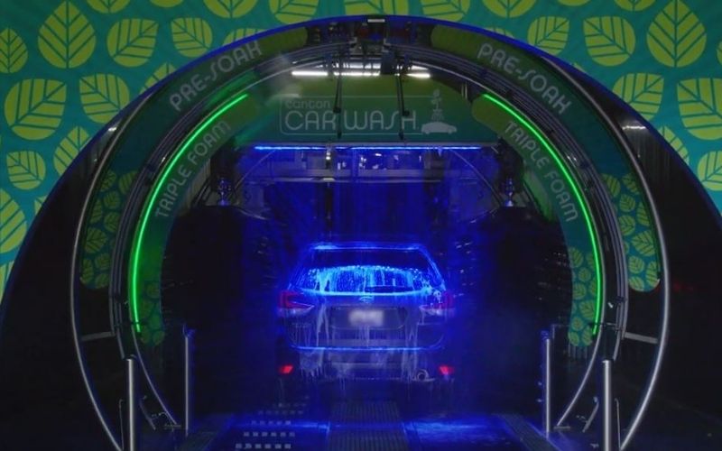
NoPileups™ is a full tunnel anti-collision system designed to optimize car wash operations. It uses patented video and advanced computer technology to track vehicles from entrance to exit, triggering emergency stops if necessary. This ensures smooth and safe operations.
 Key Features
- In-Tunnel Collision Prevention: NoPileups protects cars across the entire length of the tunnel. It automatically stops the conveyor when a collision threat is detected and captures a 15-20 second video so you can identify the cause of the issue.*
- Smart Exit Solution: With Smart Exit, NoPileups protection extends beyond the end of the conveyor, monitoring 10-15 feet beyond traditional tunnel exit collision avoidance systems. Smart Exit detects when vehicles stopped at the end of the conveyor create a collision threat, automatically stopping the conveyor to prevent the collision and restarting it when the situation clears.
- Data Collection and Vehicle Analytics: Collects extensive data on vehicle movements, distances and conveyor speeds, providing real-time insights to maximize throughput and optimize vehicle spacing.
- Maximizing Throughput: Offers detailed reports and charts comparing weekly performance, site performance within an organization and car wash industry averages to help car wash operators understand trends and identify areas for improvement. These reports can be sent to you weekly.
How Do NoPileups Reports Mazimize Your Car Wash Investment?
NoPileups reports allow you to leverage data science for greater operational efficiency in the following ways.
 Peak hour optimization
Focusing on peak hours is crucial for optimizing car wash operations. NoPileups provides charts that zero in on vehicle spacing during the busiest times, helping operators understand and improve loading efficiency. Actionable insights replace assumptions, ensuring vehicles are loaded optimally without compromising safety.
Leveraging conveyor speed data
Consistency in conveyor speed is vital for maintaining a uniform customer experience. NoPileups helps car wash operators ensure consistent speeds across locations and days, identifying outliers and addressing maintenance issues promptly.
Understanding and Reducing downtime
NoPileups reports provide detailed data analysis that helps identify the sources of downtime. Downtime data, which includes all instances when the conveyor stops, helps operators understand the impact on customer experience and operational efficiency. These insights are valuable for all levels of management, enabling operators to set KPIs and work together to reduce downtime.
Comparing Car Wash Site Performance
Comparing car wash sites helps identify which sites are performing best. You can take learnings from high-performing sites to help struggling sites improve.
Identifying Issues at the Exit
The Smart Exit solution tracks stops at the car wash exist, helping you address issues. Whether it’s the line to the vacuums, the timing of the go light or even the slope of the exit driveway, small operational changes can make a significant difference. By examining data and asking the right questions, operators can find ways to ensure customers pull out promptly, minimizing delays and improving throughput.
NoPileups Reports in Action
NoPileups provides detailed reports showing where and why stops occur. Each stop is tied to a specific camera in the tunnel, making it easy to pinpoint problem areas. Technicians review footage to label the cause of each stop, providing valuable insights for operators. For example, one NoPileups customer noticed frequent stops at a specific tunnel section. By reviewing the data and footage, they discovered a conveyor problem causing vehicles to hop rollers. Fixing this issue significantly reduced stops and improved efficiency.
NoPileups: Your Partner in Operational Efficiency
Remember, analyzing the data is just the beginning. Engage your team, set consistent KPIs, and work together to drive improvements.
Subscribe to our reports by emailing us at support@NoPileups.com.Not yet a NoPileups user? Request pricing today!
*NoPileups is not guaranteed to stop all collisions